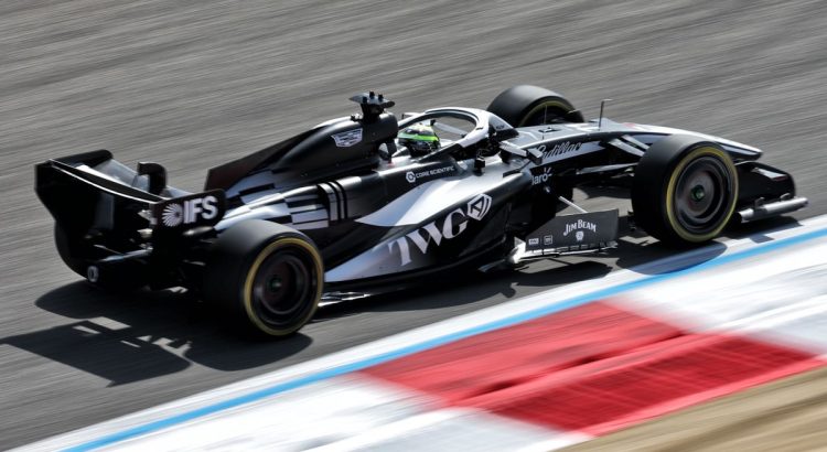
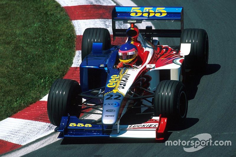
In the dazzling world of Formula 1, where bright colours are often the norm, Cadillac has decided to opt for a bold simplicity. Forget garish patterns and eye-catching designs: the American brand has chosen an asymmetric black-and-white design that is sure to spark discussions. A nod to classicism, but also to a strong identity reminiscent of the famous BAR from 1999.
A conscious decision
While fans eagerly awaited Cadillac’s first participation in Formula 1, the team surprised everyone with a minimalist approach. Instead of choosing a colourful palette, Cadillac decided to stick with a deep black and a bright white. This decision does not end here: the design is asymmetric, a rare choice in this field, reminiscent of the BAR PR01, which caused a stir at its debut.
The vision of Dan Towriss
To understand this bold decision, it suffices to listen to Dan Towriss, the team’s big boss, who shared his vision at a media meeting, including Motorsport.com. He explained that every project begins with a consideration of colours, as they convey a strong identity.
“Black represents the unwavering stance of the car. It comes across as a bit menacing, it has character. White, on the other hand, is traditionally associated with American racing cars. It is a fresh, clean, and optimistic colour. We sought a balance between these two colours.”
A historical tradition
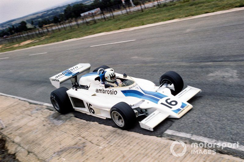
The choice of white as an emblematic colour for American cars is not new. This tradition dates back to the first half of the 20th century when vehicles participating in international competitions bore the national colours of the manufacturers. At that time, sponsors had not yet displaced the traditional shades, and each country had its own colours: blue for France, red for Italy, green for Great Britain, and so on.
A strong identity
For Towriss, the design is much more than just an aesthetic choice: “It is our identity, it represents us.” This monochrome choice reflects a trend found in Cadillac’s high-performance models, particularly in the emblems of the V-Series. Although the Cadillac logo displays vibrant colours like red, yellow, and blue, the team has decided to focus on black, white, and chrome for this adventure in Formula 1.
This approach shows that Cadillac wants to clearly position itself in the highly competitive world of F1 by presenting an image that is both modern and traditional. With the choice of such a striking design, the team hopes to be remembered and secure a place among the giants of motorsport.
Into the future
With this eye-catching design, Cadillac seems ready to take on the challenges of Formula 1. Black and white are not just aesthetic choices; they carry the promise of performance and innovation. In a sport where every detail counts, this strategy could make all the difference.
For F1 enthusiasts and car lovers, Cadillac’s adventure in the pinnacle of motorsport is one to watch closely. If you are curious to learn more about how this iconic brand plans to establish itself in the ruthless universe of Formula 1, do not hesitate to consult our articles on the news of Formula 1.