


Mercedes-Benz is not about to ditch its big screens — far from it. But the German brand is now admitting that a premium cabin is about more than a giant display and endless menus.
That shift matters more than it might first appear. It signals the end of the all-touch philosophy that had been sold for years as the obvious answer. For customers, the takeaway is refreshingly practical: future Mercedes models should move back towards simpler, easier-to-use controls for the functions you want without thinking.
At the same time, Mercedes is still insisting the screen itself remains part of the luxury statement. That tension says a lot about where the brand is heading: the digital interface stays as the showroom piece, while physical buttons reclaim the jobs they do best.
Mercedes keeps the giant screen, but trims the excess
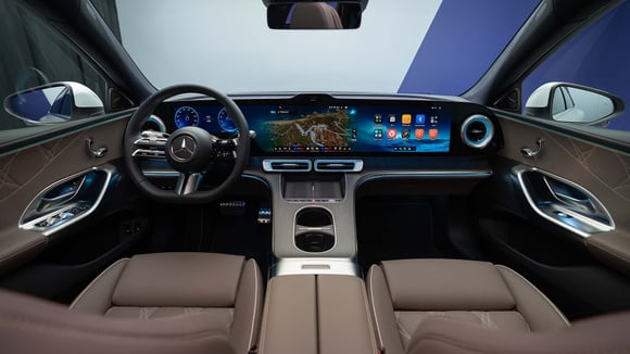
For years, car modernity was judged by screen size. The bigger the display, the clearer the message: this was a car built for the digital age. Mercedes leaned into that trend harder than most, making large, sweeping dashboards a key part of its interior identity.
The company is not backing away from that look. If anything, it is still defending it openly. Mathias Geisen, the brand’s sales boss, has described these displays as an extension of contemporary luxury. In other words, Mercedes sees the giant screen as both a status symbol and a control surface.
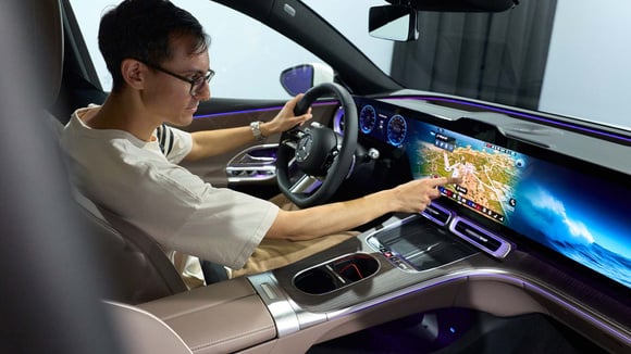
But making a dashboard behave like a tablet eventually runs into a basic problem: everyday use. On the move, digging through sub-menus has never felt especially premium. Real luxury is not just the wow factor when parked up; it is ease of use once you are actually driving.
Customers have pointed out what the screens missed
Mercedes is not pretending this is a revelation. The company admits that some customers pushed back against the touch-heavy controls it introduced in recent years. That is telling, because it confirms the argument has moved beyond theory: real-world feedback has started to shape the cabin design.
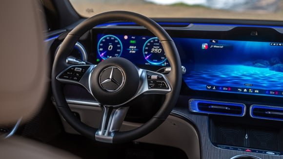
The brand has already begun making changes, especially on the steering wheel. Controls there have moved back towards a more conventional layout — less flashy, certainly, but much easier to read at a glance. This is not a humiliating retreat; it is more an acknowledgement that a cabin can be dramatic without becoming irritating.
And Mercedes is not alone. Other manufacturers have already brought back dials, shortcut buttons or dedicated switches after pushing the all-touch idea too far. It is a quiet industry correction, but a meaningful one: once a car leaves the motor show stand and heads into traffic, ergonomics quickly becomes the real measure of quality.
Everyday functions are back in focus
The real change is happening where it matters most: the simple controls. Mercedes is now promising more physical buttons for the functions drivers want to reach directly. Climate control, audio volume, rear-window demisting and similar shortcuts are exactly the sort of tasks where speed matters more than the look of a glossy menu.
That is important, because it changes how the interface works. The screen still handles infotainment, navigation, deeper settings and the theatre that helps define the cabin’s atmosphere. But the primary controls — the ones you reach for instinctively — are moving back to more tangible surfaces.
So this is not Mercedes reversing course so much as editing itself. The flashy bits stay digital. The practical bits return to proper buttons. It is a late show of common sense, really, and the driver is the one who benefits.
The electric GLC already showed the way
This did not come out of nowhere. When Mercedes revealed the electric GLC, it had already shown its hand: a 39.1-inch Hyperscreen could sit alongside the return of physical buttons and rotary controls on the steering wheel. The message was clear, even if it was not shouted from the roof: the screen was no longer meant to dominate everything else.
That matters, because it suggests Mercedes is not simply patching over a problem. It is gradually reshaping the cabin hierarchy. One side is all about visual impact and premium theatre. The other is there to make driving less fiddly and less distracting.
In use, that compromise makes plenty of sense. Screens do have an obvious advantage when the car is stationary, in the showroom or in a car park: they catch the eye and immediately feel high-end. But once you are on the move, a simple button is still hard to beat. Less glamorous, yes. Less annoying, definitely.
Mercedes is choosing balance, not a full retreat
The brand’s position is quite a subtle one. It is not turning back to a 2000s-style cabin bristling with buttons. Nor is it clinging to the fantasy of one screen ruling all. Mercedes is aiming for something else: a balance between tech theatre and day-to-day usability.
That middle ground is probably the most believable route for a premium brand. Too many physical controls can clutter a dashboard. Too much screen, on the other hand, can become tiring long before it becomes impressive. Premium buyers often want both: the visual hit and the immediate ease.
Mercedes appears to have understood that modernity is not measured solely by a glossy dashboard. It is also measured by the quality of the interactions you repeat every day. And for plenty of drivers, a well-placed button still feels more luxurious than a neatly designed menu in the wrong place.
What this actually means for customers
For buyers, the most obvious effect is simple: future Mercedes models should be less tiring to live with. That does not mean less sophisticated, just better organised. The key functions should be easier to reach, which means less time spent hunting through the interface.
For Mercedes, it is also about protecting the brand’s image. A maker like this cannot afford to let modernisation become a byword for inconvenience. Luxury car design has never really been about making life more complicated for the driver; it is about removing the unnecessary steps.
There are limits, of course. The next generation of Mercedes cars will still lean heavily on big displays, because that has become part of the brand’s visual identity. The buttons are coming back, but they are not replacing the digital set-up. In other words, the all-touch doctrine is starting to crack, but the screen is still firmly at the centre of the picture.
Mercedes is learning the lesson without losing the look
In the end, this is not a U-turn so much as a correction. Mercedes is keeping the features that make its cabins instantly recognisable, while restoring the ones that actually help in everyday use. It is less dramatic than a grand innovation speech, but far more useful in a car you will genuinely drive.
- Large screens remain central to Mercedes’ interior identity.
- Physical buttons are returning for the most frequently used functions.
- Climate control, volume and demisting are among the first to benefit.
- The steering wheel has already started to regain more conventional controls.
- The electric GLC has acted as the first clear example of this compromise.
- Mercedes is now chasing a balance between visual prestige and usability.


